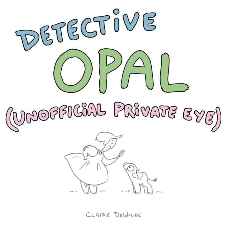
Some of you may remember my dynamic duo from last year, Opal and her tiny cow (who has been simply renamed “Tiny Cow”). Well this year I put together a pitch for a point-and-click style storybook game!
I’ll only show a few tidbits here for reasons I’m sure you understand, but if you’re interested in working with me on this, email me! I’d love to collaborate with someone who knows how to put together apps, as I think this idea would really work on digital tablets.
A filthy-yet-charming American city in the early 1900s, Grenadine is home to a colorful cast of characters. All of them are possible perpetrators of various crimes ranging from minor to major. Alternate endings reveal a different culprit each time!
What excites me about this project most is there isn’t a single character that I feel lukewarm about. All of them are dynamic and exciting in their own way and I’ve been having so much fun writing stories for them. Ultimately, I do want to make this a digital, interactive game, but in the meantime I will definitely develop a little book or two.
The assignment was simple: show a setting in three different periods of time. Knowing I’m more of a character-driven artist than setting-based, I chose to cover a short period of time rather than decades or centuries.
This project had to be done digitally. I get a little lost sometimes when it comes to digital work — it lacks the common sense of traditional tools. The professor suggested using textures as a way to bridge the gap. Very clever! I had fun scanning in different papers and even canvas, but ended up settling on ink splatters.
But these are way too many words. Here’s the STUFF:
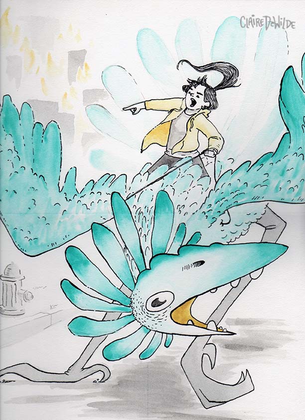
I’ve noticed a “violent bird” theme in my projects this semester. Entirely unplanned, believe it or not.
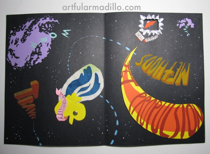
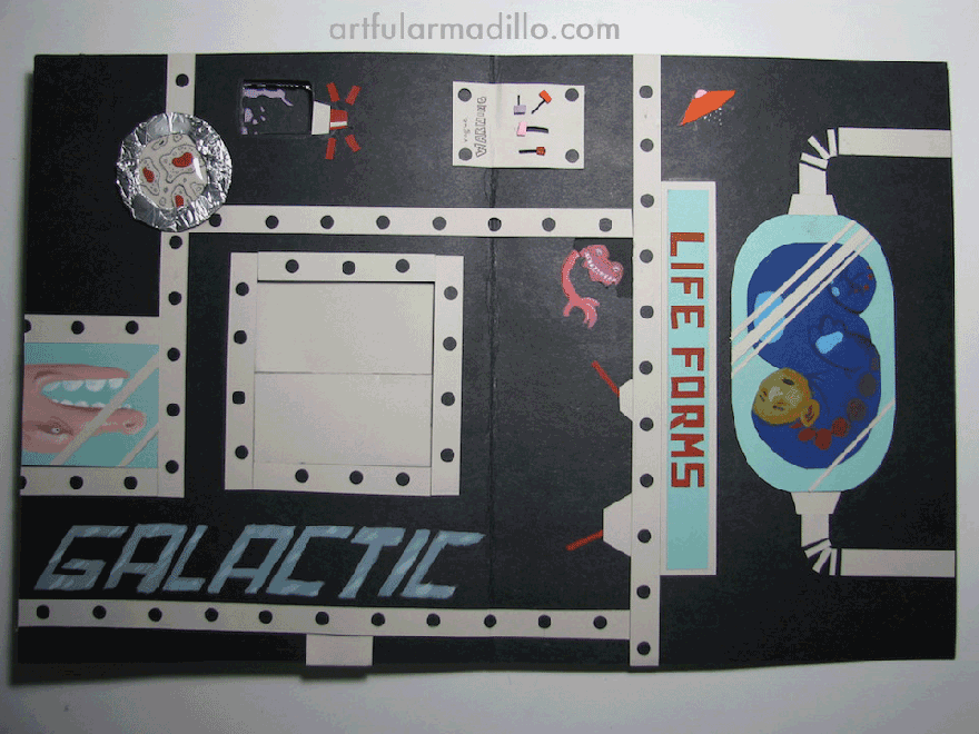
This assignment required two full spreads and a cover page with our name as the title. We could choose any subject, but every design element we used had to embody that subject. I chose Sci-Fi.
I needed to convey the feeling I get from science fiction. For me, that’s old radio shows, Douglas Adams, and Star Wars. I think a lot of people associate the genre with contemporary interpretations — gritty and dystopian. I definitely prefer the light-hearted, silly approach. It’s science fiction, after all. Let NASA deal with the bleak realities of the void!
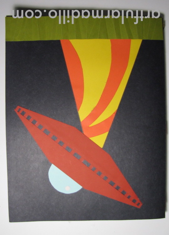
I drew a lot of inspiration from retro sci-fi posters (you can find the pin board I put together here). I wanted it to be playful and really pull the audience into it. To do this, I constructed a sort of story using colorful card stock. The cover page obliterates the viewer’s home planet, and from there the spreads have no definite direction. You’re in space now! Turn it any which way and it’ll make the same amount of sense.
There are quite a few moving parts. The improbability “dunk” (duck/skunk) spins, the “jet propulsion” propels off the page, and you’ll find that little time-traveling spaceship in the future (on the next page). In the “Galactic Life Forms” chamber, the little dials slide around under a “Vague Warning” and you can open those big shutters to reveal a Large Nose!
The back cover sets the viewer down on a new planet, with a new perspective (in the opposite direction of the title page).
Maybe view this on an iPad or something that you can turn in different directions? The thing about this project is that photos don’t really do it justice. It’s a very kinetic experience, but imagine (if you can) that urge to pull and lift as you look at these images. I hope you get a sense of how much fun I had making this!
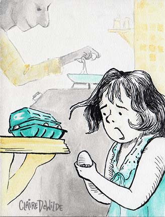
This assignment asked us to provide a three-image narrative wherein each image was essential to the story and resulted in a surprise. What I enjoyed most was actually the formatting requirements. It was assigned to be set up in a french fold (folding the paper into quadrants) so that each image was revealed in sequence, doubling in size as it opened.
Take your time with each image before scrolling to the next. Hopefully any quirks in the formatting haven’t spoiled the surprise for you!
What do you think? Was the foreshadowing too obvious, or not obvious enough? Were you surprised?
When summer began, I set up an email subscription to receive a quote every day so I wouldn’t lose creative motivation. As most resolutions go, I found myself floundering after a month or so and I decided to use these quotes more directly. I chose a few of my favorites and just got going! The project certainly got me back into the swing of things and I hope to do more of them. Some of them are sized for phone screens, and you’re welcome to use them. Click an image to view it full size.
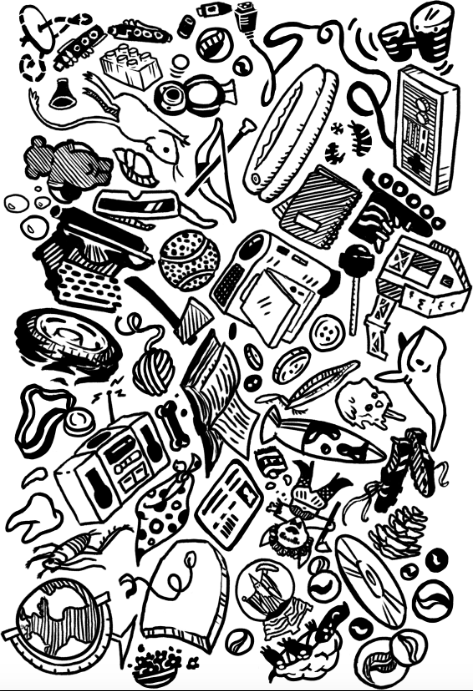
Initially, the only requirement for my pattern making final was a packed layout in two colors. I was very excited because when I doodle, I often fit the elements together just so and this assignment was right up my alley. A week or so later, however, the instructor changed her mind and decreed that the print must be autobiographical in some way. I was crestfallen. I didn’t want to talk about myself, I am myself! Why should I have to explain anything to others?
Reluctantly, I started thinking about what it is that makes me “Claire”. At first, I was so stubborn, I was going to just draw what I had planned on drawing and assert that, as a contrarian, it was autobiographical. But then, slowly but surely, I began to remember moments. I would pick out specific objects from various memories and draw them. Some of these memories hadn’t been accessed in so long, they startled me when I could recall them with such clarity. Inside jokes, old past times, so many things packed into just a couple of decades!
The tile I came up with looked like this:
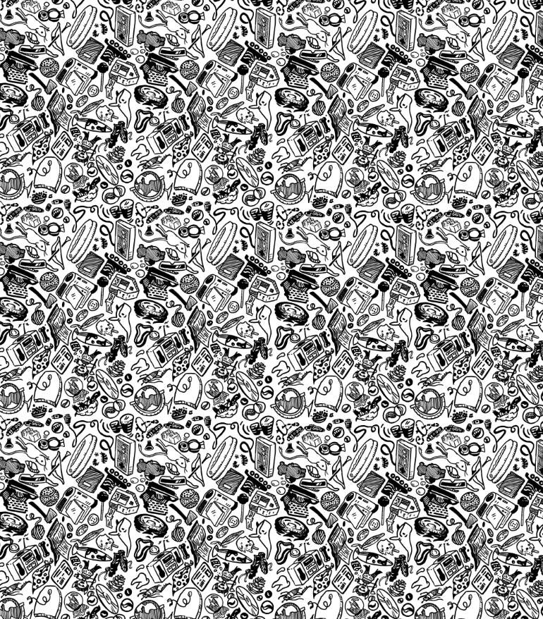
Which would have created this pattern:
Unfortunately, the photo emulsion was too gloppy and was unable to capture such fine lines, and I had to rework the pattern. Because everything had to be bigger, I was forced to choose fewer elements. The print turned out great, and in hindsight, I think the first one would have been too busy.
This semester I took a mold-making class. I wanted to learn about the materials and techniques required to replicate 3-dimensional works, ideally so I can make toys or figurines. My initial idea for my final project was to make bobble heads, but as time went on and I really started thinking about the materials, I thought it would be interesting to do something a little different.
My initial idea for an individual bobblehead.
One thing I have to say is that I had no idea how many different materials there are to work with. There’s all kinds of foams, resins, and rubbers to work with, and each material has its own rules and restrictions. Just the practice of making a mold forces you to look at the object in a whole new way. You have to think about venting, pour spout placement, and parting walls, and potential air bubbles in the mold itself. So much of the process is knowing your materials.
Over the course of the semester, I found that despite the fact that molds are meant to replicate one object again and again, there can be drastic variation between each casting. This got me thinking about the nature of replication.
A few semesters back, I took a fiber class, where I learned to crochet. Crochet is all about repetition of a single stitch to create a uniform surface. As you might know, patterns exist to guide makers into creating specific forms. Like castings, however, no two works are ever precisely alike.
A material that caught my attention early on was something called “Friendly Plastic”. This plastic comes in a container of little pellets, which you heat up and mush together to press into a mold (or you can just sculpt with it). Once it cools, it’s very lightweight. I was surprised by how much detail it could capture.
With all this in mind, I crocheted three separate “bodies” as a kind of stream of consciousness exercise. I used Super Sculpey to create five different creature heads, which I then made silicone molds of. I cast each mold three times with Friendly Plastic and attached them to the yarn bodies.
The pink silicone molds with plastic castings.
The crocheted bodies can’t be exactly replicated, as nobody (including me) knows the pattern for them. The heads, however, can be almost precisely replicated using the silicone molds, which capture even minute details.
I enjoy how tortured these heads look to be all clumped together on each body, like they all went through a malfunctioning teleportation machine. I think I will make separate bodies for some of them and make a few bobbleheads over the summer.
I am very much looking forward to experimenting with what I can do with my new skills!
My weird creatures are gaining publicity, and this year I was hired to make an acrylic painting for a young couple. After talking with the client about the newlyweds’ tastes, I came up with ideas for both composition and colors.
After getting the go-ahead, I started with a brick-red undercoat on a wood panel. This dark red served to enhance the greens of the forest, making the setting all the more vibrant. Knowing this painting would be on display, being looked at again and again, I made sure to add little touches and details to be discovered as time is spent with it. I added very thin lines, nothing too clunky, because the vibe I was striving for was one of “casual elegance”. A sense of humor and romance needed to be felt in the work.
If you would like a painting of your own, shoot me an email!
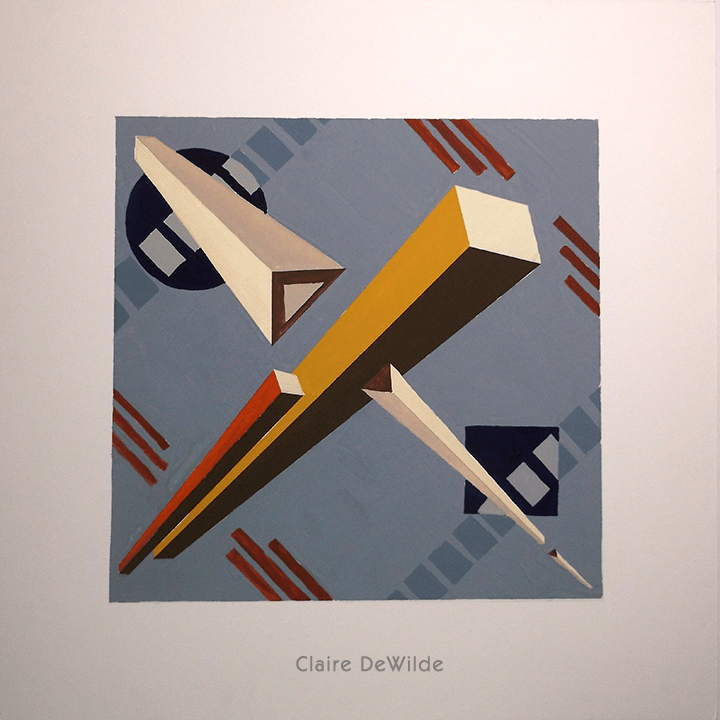
For this project, I created a series of three ideas for fabric designs based on the Constructivist art movement. A stripe, a grid, and a paisley which all had to relate to each other using the same colors. After studying the works of Russian Constructivists like El Lissitzky and the Stenberg Brothers, I came up with the following designs:
I chose to draw from the Constructivists because my work usually features a very organic line, and I thought it would be interesting to try a more machine-like approach. It was a fun experiment for me, but I think it’s apparent that this style is a little out of my comfort zone. It was a challenge to figure out how to create something that resembled paisley out of such geometric shapes!
Here’s all the tape I used to mask off areas to get a sharper edge!
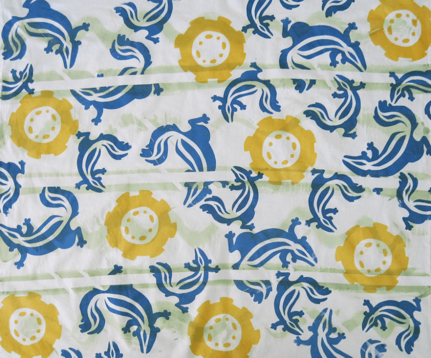
This semester, I’m taking a class called “Pattern Design and Print”. For this project, we needed to screen print four yards of muslin using the same elements in different ways. I work best when I have a theme to work off of, and the week before this was assigned, my friend’s dog had had an unlucky encounter with a skunk, stinking up her house. I decided to avenge my friend’s nose through art.
I preferred to use stencils rather than photo emulsion for two reasons: I could make stencils quickly, and I could change them out easily (I was only given two screens to work with).
I started by thumbnailing shapes for the skunk. At first I thought I wanted a linear skunk with its legs splayed out to the sides, but decided that didn’t create enough movement. I ended up creating a skunk that curved, which not only created movement, but could also interlock somewhat. I made three sizes of this design.
I experimented with the tire/road element throughout the process. I kept asking myself “How many different ways can I convey the idea of a road?”
Mixing the colors was fun, figuring out the different levels of transparency.
Anyway, enough talk, here are the results!
I masked off the stripes with tape and used a tin can to create tire tread/skunky stink.
For the tire tread, I applied tape directly to the screen and pinwheeled it so it would connect.
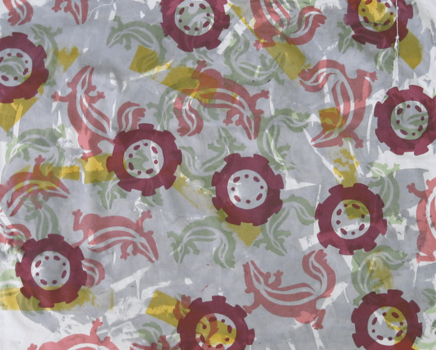
I think this one is my favorite because it’s so simple, and I’m just in love with that maroon!
For this one, I crinkled up the fabric and didn’t stretch it to achieve a craggy asphalt effect.