The Effect of Personal Effects

gecko
Gecko toy from a childhood trip to Hawaii

I’ve never met anyone who didn’t decorate their space to some extent.  Whether we realize it or not, the things we look at have a way of seeping in to the things we create.

Make rules, not copies.

owl

The objects that catch my eye are often unexpected. Each thing is different and seemingly unrelated until you see them all together. There’s an invisible thread running through them all. Hard to identify and even harder to articulate, but if you can and when do, you get a much clearer idea of what you like. Maybe you can even identify why you like them. If you can understand why you gravitate toward certain things, you don’t have to copy them but instead make something that follows the same rules.

Who’s driving the bus?toucan2

I like old things, offbeat things, sincere things like folk art, and silly frivolous things.The reason I like an item may be unclear until it is next to the plethora of other items in my studio. Most objects from childhood disappear with time, but what I’ve kept follows a lot of the same rules as the newer additions. How formative are our first possessions?

How much do our surroundings in early life inform our aesthetic preferences? Do we produce art based on those aesthetic preferences? Or do we choose our surroundings according to the art we strive to produce? Maybe, like most things in life, it’s a push and pull.

As humans we are always seeking patterns even when we don’t consciously identify them. By identifying these patterns, we can better understand ourselves.

typewriter
My Underwood typewriter is one of my favorite objects
footfish.jpg
This is part of a large installation piece I made in 2013


embroidery
My mom made this when she was about my age
bracelet.jpg
This was $2 and the fastest impulse buy I’ve ever made

Science Fiction Magazine

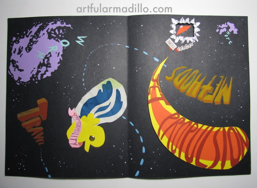
This assignment required two full spreads and a cover page with our name as the title.  We could choose any subject, but every design element we used had to embody that subject.  I chose Sci-Fi.

I needed to convey the feeling I get from science fiction.  For me, that’s old radio shows, Douglas Adams, and Star Wars.  I think a lot of people associate the genre with contemporary interpretations — gritty and dystopian.  I definitely prefer the light-hearted, silly approach.  It’s science fiction, after all.  Let NASA deal with the bleak realities of the void!

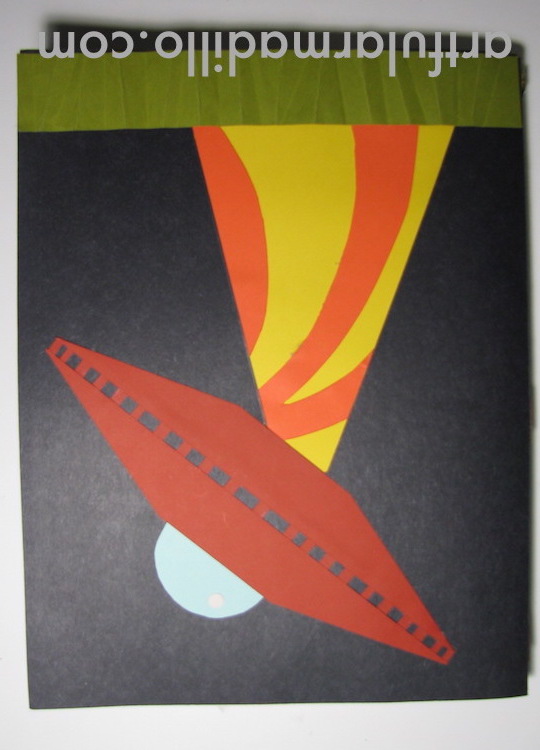
I drew a lot of inspiration from retro sci-fi posters (you can find the pin board I put together here).  I wanted it to be playful and really pull the audience into it.  To do this, I constructed a sort of story using colorful card stock.  The cover page obliterates the viewer’s home planet, and from there the spreads have no definite direction.  You’re in space now!  Turn it any which way and it’ll make the same amount of sense.

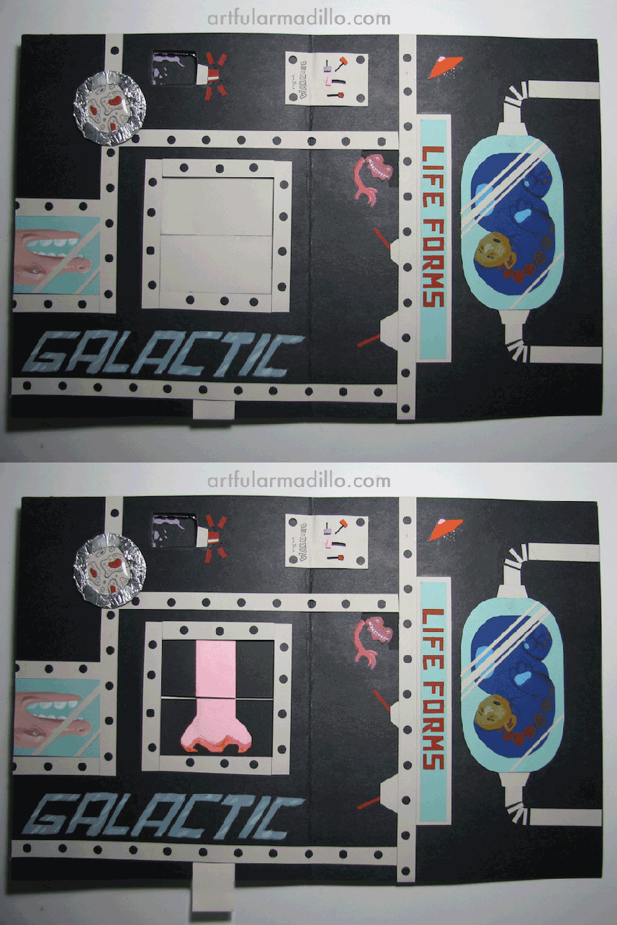
There are quite a few moving parts.  The improbability “dunk” (duck/skunk) spins, the “jet propulsion” propels off the page, and you’ll find that little time-traveling spaceship in the future (on the next page).  In the “Galactic Life Forms” chamber, the little dials slide around under a “Vague Warning” and you can open those big shutters to reveal a Large Nose!

The back cover sets the viewer down on a new planet, with a new perspective (in the opposite direction of the title page).

Maybe view this on an iPad or something that you can turn in different directions?  The thing about this project is that photos don’t really do it justice.  It’s a very kinetic experience, but imagine (if you can) that urge to pull and lift as you look at these images.  I hope you get a sense of how much fun I had making this!

IMG_2315 copy IMG_2318 copy IMG_2319-copy IMG_2323 copy

Constructivist Croquis

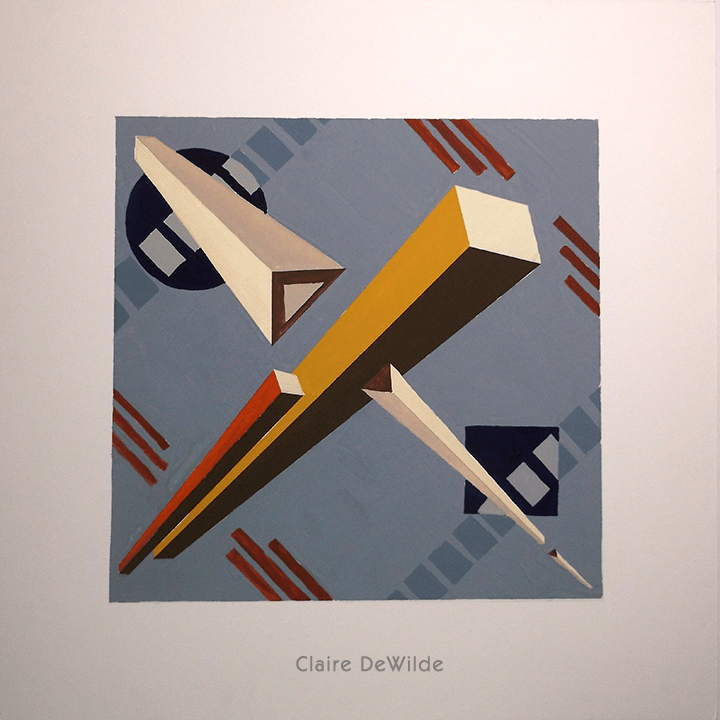
For this project, I created a series of three ideas for fabric designs based on the Constructivist art movement.  A stripe, a grid, and a paisley which all had to relate to each other using the same colors.  After studying the works of Russian Constructivists like El Lissitzky and the Stenberg Brothers, I came up with the following designs:

croqstripeweb croqgeomweb croqpaisleyweb

I chose to draw from the Constructivists because my work usually features a very organic line, and I thought it would be interesting to try a more machine-like approach.  It was a fun experiment for me, but I think it’s apparent that this style is a little out of my comfort zone.  It was a challenge to figure out how to create something that resembled paisley out of such geometric shapes!

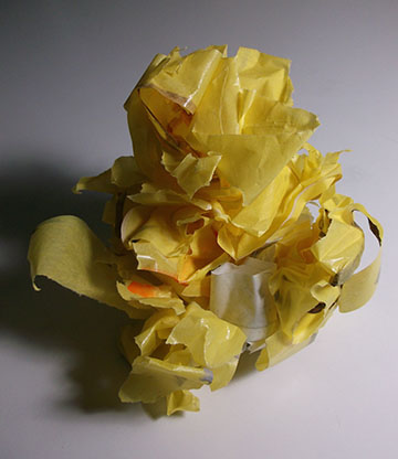
Here’s all the tape I used to mask off areas to get a sharper edge!

DSCF1452web