Nostalgia Print

Initially, the only requirement for my pattern making final was a packed layout in two colors.  I was very excited because when I doodle, I often fit the elements together just so and this assignment was right up my alley.  A week or so later, however, the instructor changed her mind and decreed that the print must be autobiographical in some way.  I was crestfallen.  I didn’t want to talk about myself, I am myself!  Why should I have to explain anything to others?

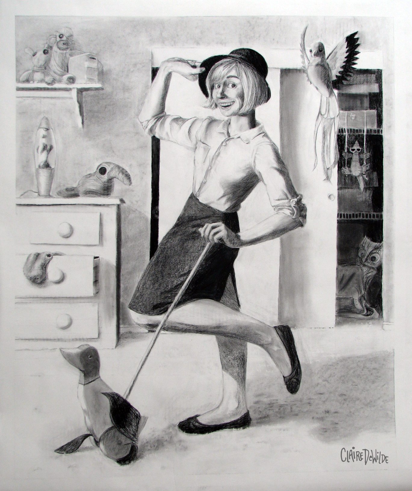
Reluctantly, I started thinking about what it is that makes me “Claire”.  At first, I was so stubborn, I was going to just draw what I had planned on drawing and assert that, as a contrarian, it was autobiographical.  But then, slowly but surely, I began to remember moments.  I would pick out specific objects from various memories and draw them.  Some of these memories hadn’t been accessed in so long, they startled me when I could recall them with such clarity.  Inside jokes, old past times, so many things packed into just a couple of decades!

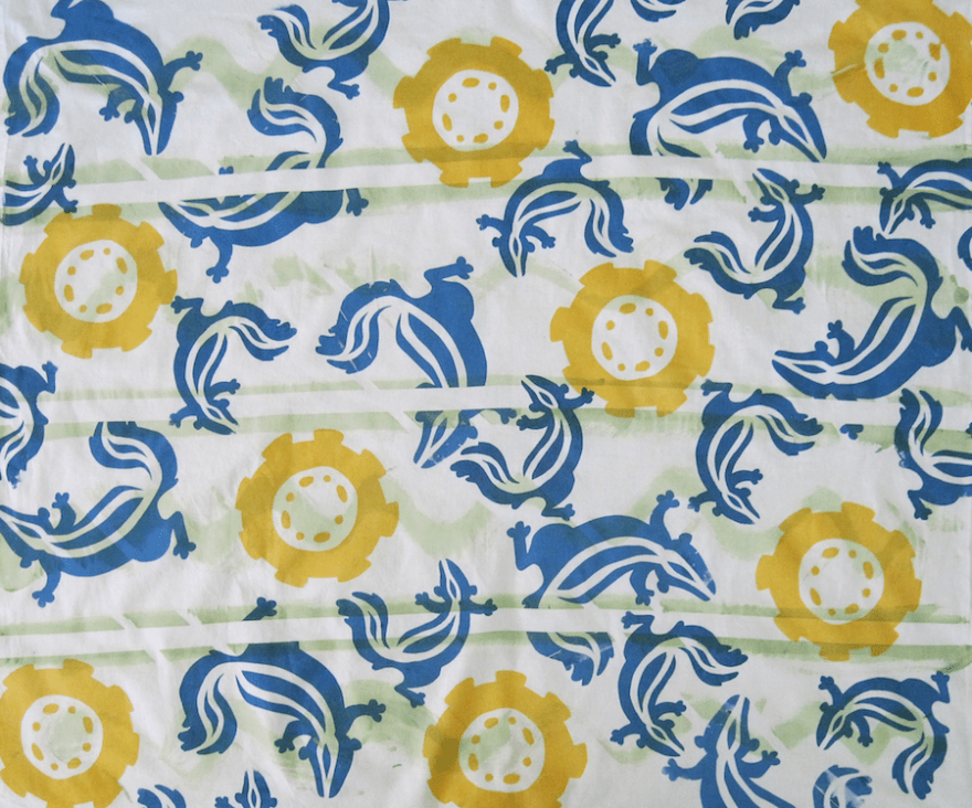
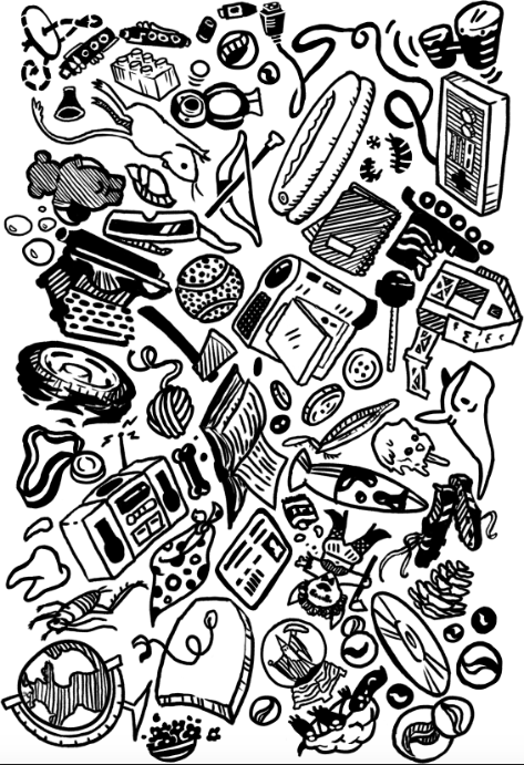
The tile I came up with looked like this:

initialdesign

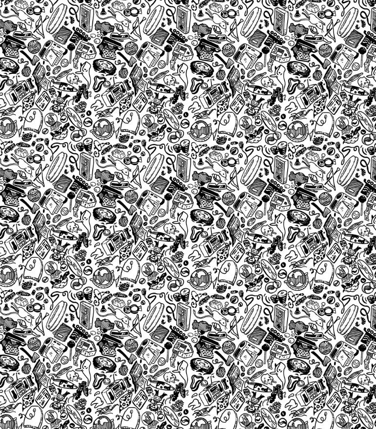
Which would have created this pattern:

initial pattern

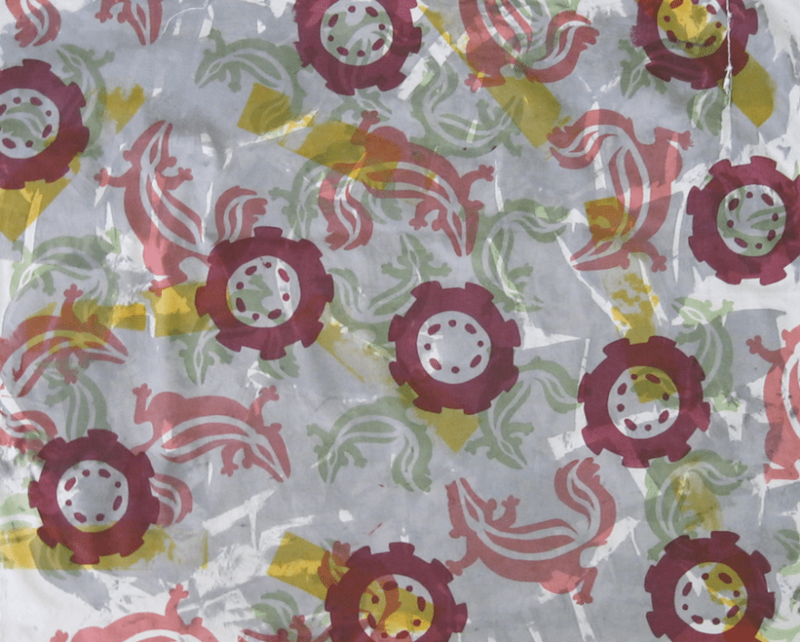
Unfortunately, the photo emulsion was too gloppy and was unable to capture such fine lines, and I had to rework the pattern.  Because everything had to be bigger, I was forced to choose fewer elements.  The print turned out great, and in hindsight, I think the first one would have been too busy.

See if you can spot the repeat!

CDeWildePattFinal

Expanding Skill Set, Perpetual Theme

This semester I took a mold-making class.  I wanted to learn about the materials and techniques required to replicate 3-dimensional works, ideally so I can make toys or figurines.  My initial idea for my final project was to make bobble heads, but as time went on and I really started thinking about the materials, I thought it would be interesting to do something a little different.

My initial idea for an individual bobblehead.

One thing I have to say is that I had no idea how many different materials there are to work with.  There’s all kinds of foams, resins, and rubbers to work with, and each material has its own rules and restrictions.  Just the practice of making a mold forces you to look at the object in a whole new way.  You have to think about venting, pour spout placement, and parting walls, and potential air bubbles in the mold itself.  So much of the process is knowing your materials.

Over the course of the semester, I found that despite the fact that molds are meant to replicate one object again and again, there can be drastic variation between each casting.  This got me thinking about the nature of replication.

A few semesters back, I took a fiber class, where I learned to crochet.  Crochet is all about repetition of a single stitch to create a uniform surface.  As you might know, patterns exist to guide makers into creating specific forms.  Like castings, however, no two works are ever precisely alike.

A material that caught my attention early on was something called “Friendly Plastic”.  This plastic comes in a container of little pellets, which you heat up and mush together to press into a mold (or you can just sculpt with it).  Once it cools, it’s very lightweight.  I was surprised by how much detail it could capture.

With all this in mind, I crocheted three separate “bodies” as a kind of stream of consciousness exercise.  I used Super Sculpey to create five different creature heads, which I then made silicone molds of.  I cast each mold three times with Friendly Plastic and attached them to the yarn bodies.

molds
The pink silicone molds with plastic castings.

The crocheted bodies can’t be exactly replicated, as nobody (including me) knows the pattern for them.  The heads, however, can be almost precisely replicated using the silicone molds, which capture even minute details.

I enjoy how tortured these heads look to be all clumped together on each body, like they all went through a malfunctioning teleportation machine.  I think I will make separate bodies for some of them and make a few bobbleheads over the summer.

I am very much looking forward to experimenting with what I can do with my new skills!


Newlywed Commission

My weird creatures are gaining publicity, and this year I was hired to make an acrylic painting for a young couple.  After talking with the client about the newlyweds’ tastes, I came up with ideas for both composition and colors.

After getting the go-ahead, I started with a brick-red undercoat on a wood panel.  This dark red served to enhance the greens of the forest, making the setting all the more vibrant.  Knowing this painting would be on display, being looked at again and again, I made sure to add little touches and details to be discovered as time is spent with it.  I added very thin lines, nothing too clunky, because the vibe I was striving for was one of “casual elegance”.  A sense of humor and romance needed to be felt in the work.

newlywedsforweb

If you would like a painting of your own, shoot me an email!

Constructivist Croquis

For this project, I created a series of three ideas for fabric designs based on the Constructivist art movement.  A stripe, a grid, and a paisley which all had to relate to each other using the same colors.  After studying the works of Russian Constructivists like El Lissitzky and the Stenberg Brothers, I came up with the following designs:

croqstripeweb croqgeomweb croqpaisleyweb

I chose to draw from the Constructivists because my work usually features a very organic line, and I thought it would be interesting to try a more machine-like approach.  It was a fun experiment for me, but I think it’s apparent that this style is a little out of my comfort zone.  It was a challenge to figure out how to create something that resembled paisley out of such geometric shapes!

Here’s all the tape I used to mask off areas to get a sharper edge!

DSCF1452web

Roadkill

This semester, I’m taking a class called “Pattern Design and Print”. For this project, we needed to screen print four yards of muslin using the same elements in different ways.  I work best when I have a theme to work off of, and the week before this was assigned, my friend’s dog had had an unlucky encounter with a skunk, stinking up her house.  I decided to avenge my friend’s nose through art.

I preferred to use stencils rather than photo emulsion for two reasons: I could make stencils quickly, and I could change them out easily (I was only given two screens to work with).

I started by thumbnailing shapes for the skunk.  At first I thought I wanted a linear skunk with its legs splayed out to the sides, but decided that didn’t create enough movement.  I ended up creating a skunk that curved, which not only created movement, but could also interlock somewhat.  I made three sizes of this design.

I experimented with the tire/road element throughout the process.  I kept asking myself “How many different ways can I convey the idea of a road?”

Mixing the colors was fun, figuring out the different levels of transparency.

Anyway, enough talk, here are the results!

roadkill1small
I masked off the stripes with tape and used a tin can to create tire tread/skunky stink.


roadkill4small
For the tire tread, I applied tape directly to the screen and pinwheeled it so it would connect.


roadkill2small
I think this one is my favorite because it’s so simple, and I’m just in love with that maroon!


roadkill3small
For this one, I crinkled up the fabric and didn’t stretch it to achieve a craggy asphalt effect.


Cinnamon

cinnamonwatermark
cinnsketchesThis commission was especially fun.  I was given total creative freedom, which can be either a blessing or a curse.  In this case it was an absolute blessing because I had been looking at a lot of Peter Parnall’s work and I wanted to try something different.

I started by sketching the dog to get familiar with the forms, then I traced over my sketch with simple, bold, organic lines.

After transferring the lines to drawing paper, I colored each shape flatly with Prismacolor pencils and then traced over the lines with a 0.5 Copic pen.

The result was an exciting modern twist on a traditional portrait.

cinnamoninframewatermark

A Portrait With All the Trimmings

finalselfiewatermark

The final project for my life drawing class was also a full body self portrait.  For this project, I challenged myself to do the opposite of my midterm (read about that project here).  My midterm was in a relatively high key (featuring predominately white/light gray tones), no crosshatching, and showed me (in an open pose) as a glamorous figure.  Therefore I wanted this project to be mostly dark with a lot of hatching, featuring myself (in a closed pose) as a weird cave-like creature (who values personal hygiene).

The midterm was absurdly welcoming, almost like an advertisement.  My goal for this final was to make the viewer feel uneasy, like an intruder.  I think I achieved this.  My classmates had eagerly discussed my midterm, but it took the class a while to warm up to this one enough to talk about it.  One student remarked that it looked “cinematic”, and I’ll never forget the soft horror in the instructor’s voice when he said “Are you…trimming your toenails?”

I had a lot of fun with this project, and my only frustration was the damage the charcoal took on the commute to and from school.

The Not-So-Perilous Misadventures of Detective Opal

I designed three characters in my character design class this semester.  We needed to invent a protagonist, sidekick, and antagonist.  I came up with a nervous turtle-girl and her faithful pet, a tiny cow.

Opal and Mimi try to solve mysteries in a big city in America in the 1910s (I just love the architecture and fashion of that time).  Ms. Bonbidet is their snooty neighbor who says little girls should not be running around solving mysteries.

But enough exposition!  Here are my development sketches:

opalroughs1

mimiroughs

missbonbidetroughs

opalandmimiroughs
It was fun to explore how a tiny cow and a turtle-girl would relate to each other. I think they make a cute pair!

detectiveopallayoutrough

detectiveopallineup

The sketches were all done with Copic markers, and the clean up lineup was done in gouache and pen.  I hope to do something with these characters sometime soon!

The 18-Hour Selfie

The midterm for my life drawing class this semester was to create a full-body self portrait using charcoal.  Because this is a life drawing class, photo reference is prohibited (you can imagine how difficult the right hand was to complete!).

The Idea

Now, as those of you who have experience with self portraits from life will know, the simplest and most common method is to keep your face expressionless.  This is because the best way to ensure that your features stay in the same relative positions (and your facial muscles don’t get sore).  However, I had drawn so many self portraits this semester, I decided to make things more interesting (read: difficult).

The Undertaking

The biggest mirror I currently have access to is in my parents’ room.  With their permission, I set up a makeshift studio.  The limited space did not allow room for an easel, and this paper is 42″ tall.  My solution was to stack two bean bag chairs on my parents’ bed and lean the paper, which I had taped to a large piece of cardboard, against them.  (Naturally, I was careful to put a cover over everything!)

Then there was the problem of lighting.  My clip light was not nearly tall enough, but with the help of a fabric steamer and an extension cord, I was able to light myself from head to toe.

Now came the fun part: standing on one foot for hours on end!  The most nerve-racking aspect of the whole undertaking was probably the threat of getting charcoal on my nice white button-up shirt.  It took me about nine hours to nail down the body, and then I spent two hours working on my face.  It’s a good thing I like to smile, because holding that wacky expression for so long might have otherwise driven me insane.  It was a solid day or so before my cheek-muscles finally forgave me.

Next, it was time to draw the environment.  I didn’t want to draw my parents’ room, but I was smart enough to draw the horizon line so it wouldn’t look too wonky when I changed rooms.  I then set up shop in my own room and recreated the lighting as accurately as possible.  For this part, I had a medium-sized mirror aimed at myself so I could see how everything in the room related to my body.  I then proceeded to draw the room using the mirror as well as direct observation.  This part of the drawing took only seven hours.

The Result

Overall, I’m very happy with the outcome of this project.   It was a lot of fun to work on and it was very well received by the class.  I set out to put a silly and original spin on a traditionally serious and dreary assignment, and I think I accomplished that.  There is a minor issue with proportion (kudos if you can spot it!), which I think is partly because I had to stand so close to the mirror.  I didn’t originally intend to include so many birds in the composition, but once the rolling duck and the quetzal (hanging from the ceiling) established a pattern, I ran with it.  I never realized how many bird-related objects I owned prior to this drawing!

Dimensions: 32 x 38″
Total drawing time: 18 hours

New Photoshop Brushes!

I’ve never been a huge fan of drawing digitally, but then I downloaded a few of Kyle T. Webster’s Photoshop brushes and I’m addicted!  (Okay, that sounded sponsored, but I promise I’m not being paid to say this.)  They feel natural enough that I’m comfortable drawing directly into the computer (as opposed to my usual method of scanning a physical drawing and coloring/altering it digitally).

Here are some drawings I’ve created so far:

gassygordonundies

The following drawings were created for the Union Weekly at CSULB:

filmphonographpaidseating

Here’s where to get these brushes for yourself!